Configure Your Phone
Republic Wireless
Experience Design Strategy
Challenges
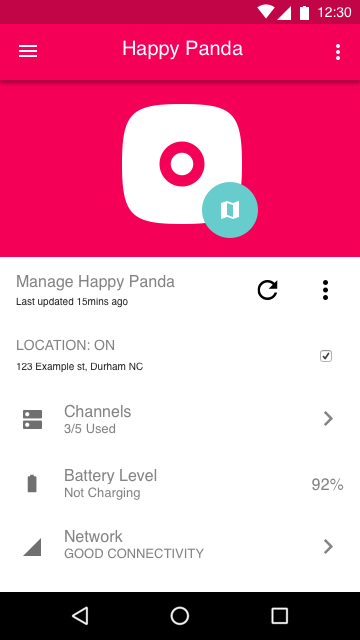
The app had to served three separate functions for our users:
- To manage Relay devices
- As a location tracker
- As a communication tool
experience goals
We wanted the communication tool to look & act like the relay device as much as possible for consistency and branding purposes.
Responsibilities
User experience strategy, stake holder Interviews, competitive analysis, system diagrams, wireframes, ui design, prototyping, usability testing.
Workflow
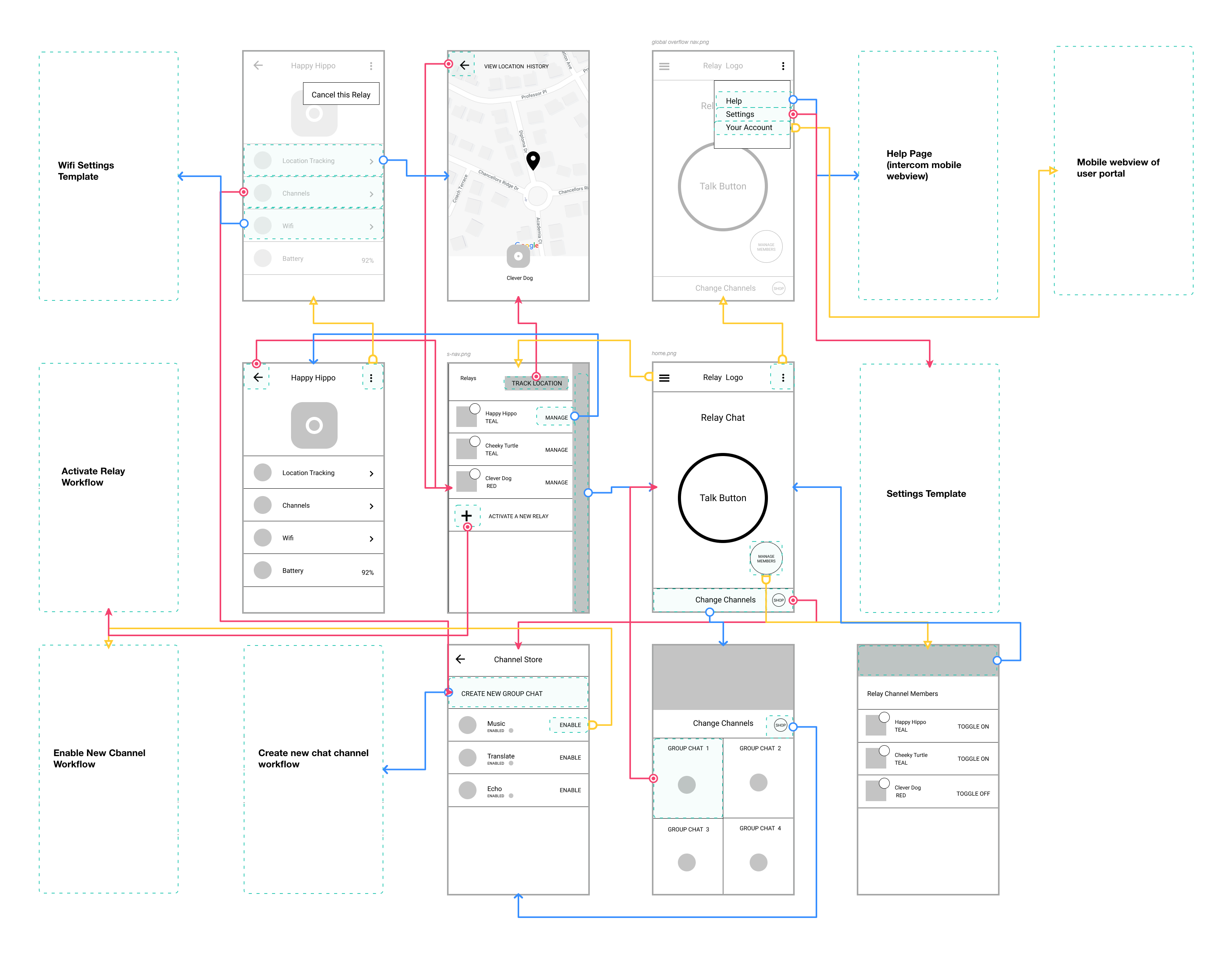
Wireframes


Interaction Guide

Information Architecture
LEARNINGS
We designed the solution for the information architecture challenge after watching the beta testers out in the field.
- Device management was put into the side nav, after users told us they did not need to configure their devices often after activation.
- We made the shop icon much more prominent by adding it to the home screen.
- We created consistency with the large single button in the middle, mirroring the industrial design and interaction pattern on the physical device.